


The way people communicate with online products has dramatically evolved in the last ten years. Smartphones have become the main device for browsing, shopping, learning, and handling routine tasks. Consequentially, businesses
The way people communicate with online products has dramatically evolved in the last ten years. Smartphones have become the main device for browsing, shopping, learning, and handling routine tasks. Consequentially, businesses must re-consider how their online experiences are engineered for their audience.
Today, developing a smooth mobile experience needs more than just reducing a desktop interface. Companies greatly team up with a mobile ux design agency to make sure their websites and applications feel responsive, intuitive, and user-centric across diverse sizes of screen and usage contexts.
Mobile UX design is no longer just a concern for the designers — it impacts retention, engagement, and conversion directly.
The Shift Toward Mobile-Driven Online Experiences
For different users, mobile devices are often the first and the only way they access their digital services. Ranging from social media to financial platforms, people expect online products to flawlessly work on smaller screens,
However, mobile designing brings forth unique challenges:
- limited space in screens.
- touch-based interaction instead of cursor navigation.
- Distinct device sizes and resolutions.
- Intermittent network conditions.
These constraints need designers to reconsider conventional interface structures. Instead of complex menus in navigation and dense layouts of information, mobile experience must emphasize speed, clarity, and simplicity.
What Makes Mobile UX Different From Desktop UX?
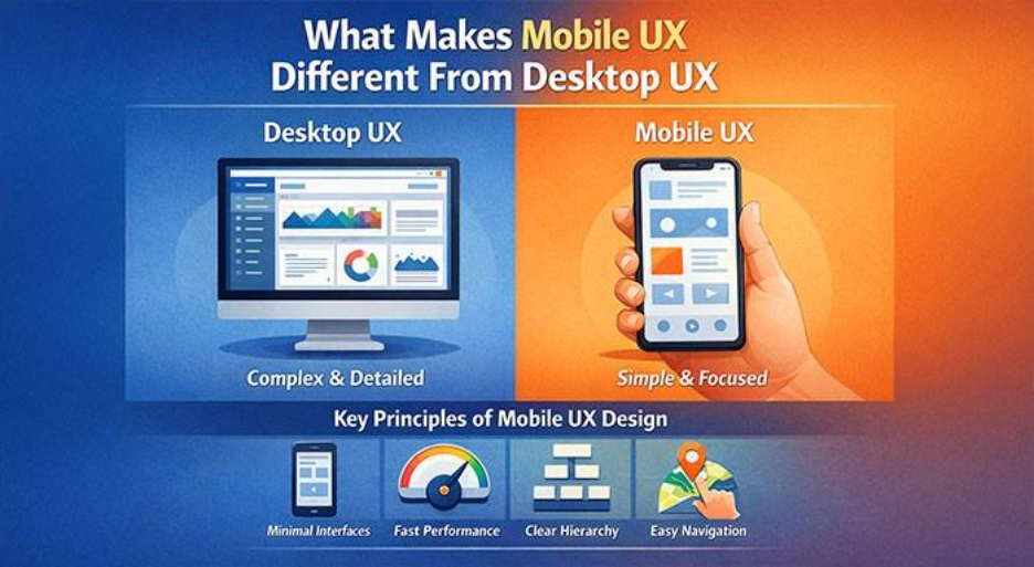
Desktop interfaces support greater visual complexity. Larger screens provide support to different panels, in-depth dashboards, and extended menus. However, mobile devices require a more concentrated design approach. Understanding UX Design Basics helps designers adapt experiences effectively across different screen sizes and user behaviors.
Mobile UX design focuses on:
- quick performance loading
- minimal interfaces
- clear hierarchy in visuals
- streamlined patterns of navigation
Designers choose the information that can truly make an impact and delete the clutter that adds no value but increases complexity. It is a prioritization process, which is one of the core UX Design Basics that drives every effective mobile UX design.
The Significance of Touch-Friendly Interfaces
Contrary to desktop platforms that depend on accurate movements of cursor, mobile devices rely on finger interactions. This difference greatly changes how interfaces can be structured.
Touch-friendly design needs:
- Larger elements of interaction.
- Gesture-driven navigation.
- Comfortable spacing between different buttons.
- User actions-based responsive feedback.
If the size of buttons are too small or they are stacked close together, users become frustrated a lot quickly. An expertly crafted mobile interface expects such physical patterns and adjusts them accordingly.
Speed and Performance Are Vital
Mobile users generally work under less stable network conditions. Laggy interfaces or slow loading pages can lead to abandonment quickly and higher bounce rates.
Therefore, optimizing mobile UX involves technical considerations like:
- Optimization of image.
- Efficient structure of code.
- Minimized loading time.
- Progressive rendering of content.
Such enhancements aid in making sure that mobile users quickly access content without redundant delays.
Consistency Across Devices
Modern users switch between devices frequently during similar tasks. A person might research a product on their smartphone, continue on their computers, or complete purchase on a tablet which they had started on their smartphones.
For this reason, digital products must maintain consistent design patterns across platforms.
Consistency involves:
• recognizable structures of navigation.
• similar patterns of interaction
• shared visual elements
• unified elements of branding.
A consistent experience enables users to switch between devices without requiring to re-learn the working of the interface. Therefore, businesses investing in professional WordPress development and web development services look to ensure more complete cross-device experiences.
Designing for Context and Behavior
Mobile devices are generally utilized in short bursts throughout the day. People check apps while commuting, waiting in line, or multitasking.
This context influences design decisions. Mobile interfaces should support quick interactions and easy task completion.
Examples include:
- Streamlined methods for login.
- Quick accessibility to features frequently used.
- Clear CTAs
- Simplified flows of checkout.
Design that respects the context of user greatly enhances user satisfaction and usability.
Strong Mobile UX’s Business Impact
A mobile experience that is designed well impacts diverse business metrics. Companies that investing in finely crafted UX generally see enhancements in:
- Customer retention
- Conversion rates
- Session duration
- Brand perception
When users feel quite comfortable navigating an interface, there is more possibility for them to trust a product and continue utilizing it.
Mobile UX Design Future
Emerging technologies like voice interfaces, AI-based customization, and gesture-driven navigation will continue to impact mobile experiences. Designers must adjust to evolving expectations of user and new models of interaction.
Wearable technology, foldable devices, and mixed-reality ecosystems may also introduce new challenges in design in the forthcoming years. Preparing for such changes needs flexible systems of design and robust understanding of human-driven interaction.
Conclusion
Mobile devices have transformed how people interact with online products. Creating an optimal design for such environments needs deeper attention to performance, usability, and patterns of interaction.
Organizations that emphasize mobile UX are more effectively positioned to ensure higher experiences that feel efficient and intuitive. As mobile usage grows around the world continuously, investment in effective design strategies will be vital for businesses looking to deliver effective online products.
Respond to this article with emojis