

Start with the problem Teams need consistent visuals across product, website, email, ads, and documentation. Budgets are tight. Releases are frequent. Commissioned art for every sprint is not realistic. Random
Start with the problem
Teams need consistent visuals across product, website, email, ads, and documentation. Budgets are tight. Releases are frequent. Commissioned art for every sprint is not realistic. Random pictures look cheap and break trust. Ouch by Icons8 solves that problem with style based artwork that behaves like a small visual language you can adopt in a day and grow for months.
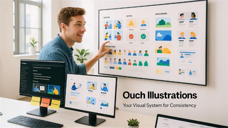
What Ouch actually is
A curated catalog of vector scenes and high resolution rasters organized by coherent styles. Each style has matching proportions, line weight, and color logic. The result is a set of pieces that play well together. You browse, filter by topic or use case, and pull exactly what a screen needs. Files ship as SVG and PNG. SVG gives full control in design tools and in code. PNG is the drop in option for email and social where SVG can be unreliable.
Content types cover marketing heroes, product feature explainers, onboarding steps, empty and error states, characters and props, abstract backgrounds, and tiny spots for cards and tooltips. Many assets include state variants so you can keep the same tone across success, warning, and error.
A tiny system that scales
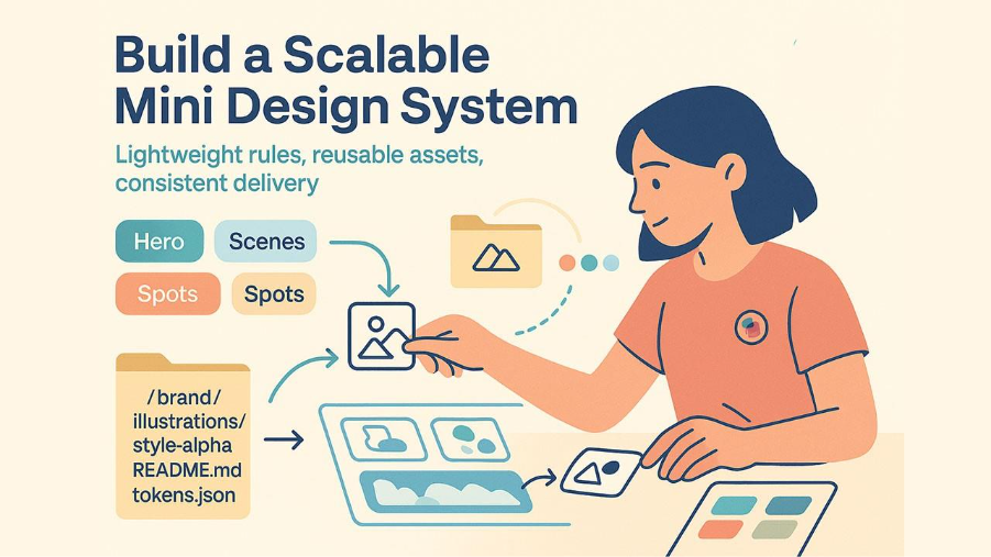
Treat a chosen style as a micro system. Define a small kit your team reuses. One hero, two scenes, three spots, one background. Add a color map that aligns with your tokens. Document rules in a short README next to the assets. Decide how far recoloring goes. Decide how characters are used. Decide when not to use imagery at all. This is enough governance to keep screens consistent without slowing delivery. Whether you're building a complete marketing illustration kit or focusing on product screens, establishing these guidelines early prevents visual drift and speeds up decision making across your entire team.
Suggested folder structure in your repo:
/brand/illustrations/
/style-alpha/
README.md
tokens.json
hero/
scenes/
spots/
backgrounds/
The README lists allowed crops, export sizes, and color overrides. The tokens file maps fills and strokes to brand variables.
Selection criteria that save rework
Pick a style only after it proves itself on real screens. Build a quick test set. Homepage hero. Pricing callout. First step of onboarding. One empty state. Swap styles without touching layout or copy. Put the four screens in front of five people who do not know your brand. Ask for three adjectives. If the words for a style cluster around the ones in your voice guide, keep it. If they drift, drop it.
Evaluate three things before you commit.
- Coverage across the journey. Marketing and product. Not only landing pages.
- Range inside the style. Enough characters, objects, and backgrounds to avoid repetition during a long roadmap.
- Editability. Recoloring should not require an illustrator on every ticket.
Accessibility is not optional
Images must work for everyone.
Alt text decision. If an image conveys information, write clear alt text that delivers the same idea. If it is decorative, use empty alt so assistive tech skips it. Inline SVG needs a short title and, when helpful, a longer description.
<svg role="img" aria-labelledby="t d" width="512" height="256">
  <title id="t">People setting analytics goals on a shared board</title>
  <desc id="d">Two colleagues moving charts and sticky notes while a third reviews results</desc>
  <!-- vector content -->
</svg>
Contrast and color. When the artwork includes text or relies on color to signal state, follow WCAG 2.2 contrast ratios. Interactive colors must match tokens used in components so people do not misread meaning.
Representation. Check for inclusive characters and contexts. Avoid stereotypes. When in doubt, pick neutral props and activities that match your domain.
For deeper guidance, keep the W3C WAI documentation, MDN pages on SVG accessibility, and the NN Group articles on visual communication in your bookmarks. Web.dev has clear guidance on responsive images and performance budgets.
Performance guardrails
Images are usually your heaviest assets. Give them a budget and enforce it.
- Prefer SVG when it tells the story without texture or photography
- Export PNG only at the sizes you actually render
- Always set width and height to prevent layout shifts
- Lazy load below the fold
- Test Largest Contentful Paint on the real pages that use artwork
A simple Next.js example for a marketing PNG:
import Image from "next/image";
export default function Promo() {
  return (
    <Image
      src="/assets/ouch-promo.png"
      alt="Team reviewing analytics on a laptop"
      width={1200}
      height={628}
      priority
    />
  );
}
And inline SVG with theme variables:
<style>
  :root { --accent: #1f6feb; }
  @media (prefers-color-scheme: dark) { :root { --accent: #8b5cf6; } }
  svg [data-accent] { fill: var(--accent); }
</style>
<svg role="img" aria-labelledby="a b">
  <title id="a">Growth chart</title>
  <desc id="b">Line rising across a grid with confetti</desc>
  <path data-accent d="M…" />
</svg>
Role specific playbooks
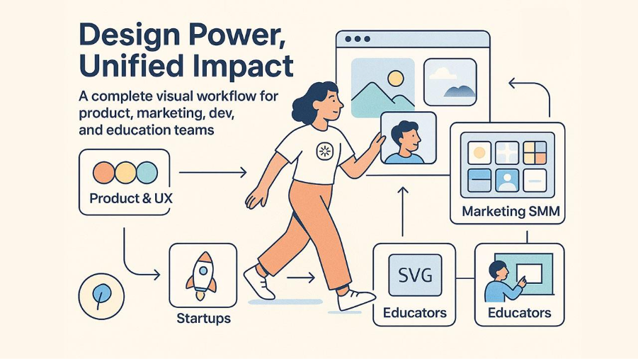
Product and UX
Use imagery to clarify, not to decorate. Empty states work best with one short line and a single primary action. Onboarding screens benefit from a simple sequence. Start. Progress. Success. Convert SVGs into components in your design tool and map fills to color styles so you can flip themes quickly. Do not cram scenes into tight spaces. When in doubt, use a small spot and give copy room to breathe.
Marketing and SMM
Speed wins. Define a content grid for social. Square. Vertical. Horizontal. Pre crop key scenes for those frames and store them with predictable names. Keep one recurring character or prop across a campaign to help recall. For email, prefer PNG and compress carefully. Many clients still throttle SVG support. A well-organized marketing illustration kit streamlines campaign production by providing ready to use assets that maintain brand consistency across channels while reducing turnaround time for launches and promotions.
Developers
In the era of Digital Transformation, treat artwork like code. Version it. Name it with ownership. Keep it near the component that renders it. Inline SVG enables CSS variable theming and state changes without a new export. Never block the critical path with large imagery. If you need motion, animate in code or your motion tool rather than shipping heavy video.
Educators and institutions
Ouch works in class. Students can learn layout, hierarchy, rhythm, and color by remixing existing scenes. Write assignments that constrain the style pack and the palette so evaluation focuses on communication rather than drawing skill. Keep license receipts and attributions in the course repo. That habit prevents headaches when students publish portfolios.
Startups and small businesses
Pick one style and freeze it for a quarter. Apply it to the site, the deck, the store listing, and the top five product screens. This creates cohesion without waiting for a full brand overhaul. As the team grows, commission custom pieces inside the same style for unique moments like pricing or a signature feature.
Midpoint checkpoint and link reference
Halfway through adoption, teams ask for a place to browse and validate choices. Keep a direct reference to the catalog near your kit so new teammates can see the source. Here is the quickest path while you evaluate styles and build your first kit: illustration.
Field tested workflows
Forty five minute evaluation
- Shortlist two styles that match your voice adjectives
- Pull one hero, two scenes, and three spots from each
- Drop them into four target screens and recolor accents to tokens
- Share with five people outside the team and collect three adjectives per style
One day adoption
- Lock the winning style
- Create the initial kit and folder structure
- Write a two page README with do and do not rules
- Replace art on the homepage, one feature page, onboarding start, and one empty state
One week rollout
- Extend the kit with five more spots and one background
- Build a small component library in your design tool
- Convert two key scenes into editable templates
- Add accessibility checks to your pull request template
Strengths you can bank on
- Style families behave like systems rather than one off pictures
- Vector source enables recolor, recomposition, and infinite scaling
- Coverage includes real product moments like onboarding, error, and empty states
- High resolution PNGs cover email and social without fuzziness
Limitations to plan around
- Some niche scenes will require compositing two or three pieces
- Motion requires work in your animation tool
- The wide catalog can slow teams without a simple decision rule
Licensing and governance
Icons8 publishes clear license terms. Free usage usually requires credit. Paid plans remove attribution and relax limits. Read the current license on the site and save receipts in your brand folder. Track where each asset ships. Add a credit file to public repos when attribution is required.
Concrete tips that cut waste
- Keep a top ten list of assets you reuse most and store them as editable components
- Write alt text in pull requests so reviewers can audit accessibility quickly
- Give heroes a hard size budget and enforce it in CI with an asset check
- Use a shared color map so recolors never drift from tokens
- Name files by owning page or component to make search sane
Sources worth your time
- W3C WAI on text alternatives and contrast for WCAG 2.2
- MDN on SVG accessibility and embedding
- Web.dev on responsive images, formats, and performance budgets
- NN Group on imagery and comprehension in UX
- Illustration guidance inside Shopify Polaris and Google Material Design
Respond to this article with emojis